How to Optimize Images for Your Website: WebP, Sizes and Lazy Loading
A practical guide to image optimization for business websites. Which format to use, what size to export, how much to compress, and the small HTML details that stop pages jumping around.
Images are usually the heaviest thing on a web page, and on most small business sites they're the main reason pages load slowly. The good news: image optimization is the easiest speed fix there is. Most of it needs no developer, and the gains are big.
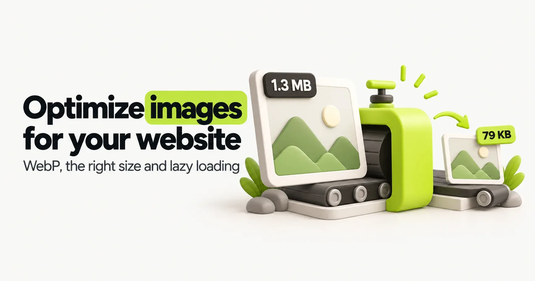
A real example from this blog. The cover images for our first posts came out of our design tool as PNG files of about 1.3 MB each. Saved as WebP, they're 65 to 80 KB. That's around 94% smaller, and you can't tell the difference on screen. On a phone on 4G, it's the difference between a cover that pops in and one that crawls down the screen line by line.
What makes an image heavy
Four things, and you control all of them:
Its size in pixels. A 4000-pixel-wide phone photo shown in an 800-pixel box carries about six times more pixels than even a sharp phone screen can use.
Its format. A photo saved as PNG can easily be five to ten times bigger than the same photo as JPEG or WebP.
How much it's compressed. Quality 100 and quality 80 usually look identical, but the file at 80 is often less than half the size.
When it loads. Images far down the page that load straight away compete with the ones visitors can actually see.
Pick the right format
Format | Best for | Transparency | Good to know |
|---|---|---|---|
JPEG | Photos, when nothing newer is an option | No | Works everywhere. Fine at quality 75 to 85. |
PNG | Screenshots and simple graphics that need to stay pixel-perfect | Yes | Lossless, so photos come out huge. |
WebP | Almost everything: photos, graphics, transparent images | Yes | Works in every current browser. Typically 25 to 35% smaller than JPEG at the same quality. |
AVIF | Photos where every kilobyte counts | Yes | Often smaller than WebP, but slower to create. Supported in current Chrome, Edge, Firefox and Safari. |
SVG | Logos, icons and simple illustrations | Yes | Made of shapes rather than pixels, so it's sharp at any size and usually tiny. |
Our rule of thumb: WebP for photos and graphics, SVG for logos and icons. AVIF is great when your platform creates it for you automatically, but it isn't worth converting by hand for most sites. The extra saving over WebP is small next to the saving from getting the size right.
Export at the right size
A photo from a modern phone is 4000 pixels wide or more. Even on a big laptop screen, a picture inside an article is shown at around 700 to 800 pixels wide. Everything beyond what's needed is wasted download.
The simple rule: export at about twice the width it's shown at, so it stays sharp on high-resolution phone and laptop screens, and no bigger.
Where the image goes | Shown at roughly | Export at |
|---|---|---|
Full-width banner at the top of a page | 1200 to 1440 px | 1920 to 2400 px wide |
Image inside a blog post or page | 700 to 800 px | 1400 to 1600 px wide |
Product photo in a grid | 300 to 400 px | 800 px wide |
Team photo or small thumbnail | 150 to 300 px | 400 to 600 px wide |
Logo | Varies | SVG if you have it, otherwise twice its display size |
Not sure how big an image is shown? On a laptop, right-click it in Chrome, choose Inspect, and hover over the highlighted line. The browser shows its size on the page.
If your site is custom-built, your developer can go a step further with srcset, which offers the browser a few sizes of the same image and lets it pick a small one for phones and a big one for large screens. WordPress does this automatically for images you add through the media library.
Compress it, then check it
For photos, quality 75 to 85 is the sweet spot. Below that you start to see blur and blocky edges, especially around text and faces. Above it, the file grows fast for no visible gain.
Squoosh is a free tool from Google's Chrome team that runs in your browser. Drop an image in, pick WebP, and drag a slider to compare the original and the compressed version side by side. Nothing is uploaded to a server.
Want a quick idea of the saving? Here's this post's own cover image, converted live in your browser. Change the size and quality to see the difference, or try one of your own images. Nothing is uploaded or saved.
If the saving surprises you, that's normal. Most images on small business sites were uploaded straight from a phone or a stock photo site and never touched.
Lazy loading: load images only when they're needed
Lazy loading tells the browser not to download an image until the visitor scrolls close to it. On a long page with twenty product photos, visitors download the three or four they can see first, not all twenty, before the page is ready to use.
In HTML it's one attribute:
<img src="kaju-katli.webp" alt="Box of kaju katli" width="800" height="800" loading="lazy">
WordPress adds it to most images automatically, and most website builders do the same.
The one mistake to avoid: never lazy-load the big image at the top of the page. That image is usually what Google measures for Largest Contentful Paint, one of its Core Web Vitals, and lazy loading it makes the page slower, not faster. For that image, do the opposite and tell the browser it matters most:
<img src="shop-front.webp" alt="Front of Sharma Sweets on MG Road" width="1600" height="900" fetchpriority="high">
Always set a width and height
When the browser knows an image's shape in advance, it saves the space before the file arrives. Without it, the text jumps down when the image loads, and the visitor loses their place. Google measures this as Cumulative Layout Shift.
The width and height don't stop an image from being responsive. Your CSS can still make it fill the screen on a phone; the two numbers just tell the browser its proportions. Most builders handle this for you. On hand-coded and older WordPress themes, it's worth checking.
Name and describe your images
Two small habits help both search engines and people using screen readers:
Write real alt text. Describe what's in the picture in a short sentence. "Front of Sharma Sweets on MG Road, Jaipur, at night" is far more useful than "shop" or a string of keywords. Purely decorative images can have empty alt text.
Use words in file names.
sharma-sweets-shop-front.webptells Google something.IMG_20240512_183022.jpgdoesn't.
Your image checklist
Photos and graphics are WebP (or AVIF if your platform makes it for you); logos and icons are SVG.
Every image is exported at no more than twice the width it's shown at.
Photos are compressed to quality 75 to 85.
Every image has a width, a height and alt text.
Images below the first screen use
loading="lazy". The top image doesn't.
On Wix, Shopify and similar builders, resizing and modern formats are handled when the image is shown, so your job is mostly picking good photos and writing alt text. On WordPress and custom sites, compressing before you upload makes a real difference, because the original file is often what gets used.
Frequently asked questions
- What is the best image format for websites?
- WebP is the best choice for most photos and graphics because it's much smaller than JPEG and PNG and works in all current browsers. Use SVG for logos and icons. AVIF can be even smaller and is worth using when your platform creates it automatically.
- What size should images be for a website?
- Export each image at about twice the width it's shown at, and no more. That's roughly 1400 to 1600 pixels wide for an image inside a page, and 1920 to 2400 pixels for a full-width banner.
- Does image optimization help SEO?
- Yes. Lighter images make pages load faster, which helps your Core Web Vitals, keeps visitors from leaving and makes your pages easier for Google to crawl. Good alt text and file names also help your images show up in Google Images.
- Should I use WebP or AVIF?
- WebP is the safe default and is easy to create with free tools. AVIF usually saves a bit more but takes longer to create and is harder to edit, so use it when your website platform or image service produces it for you.
- Does lazy loading hurt SEO?
- No. Google can find and index images that use the browser's built-in loading="lazy". The only thing to avoid is lazy-loading the main image at the top of the page, because that slows down how fast the page appears.
- How do I convert images to WebP for free?
- Use Squoosh (squoosh.app) in your browser, or export as WebP from your design tool if it supports it. Many WordPress image plugins can also convert your uploads to WebP automatically.